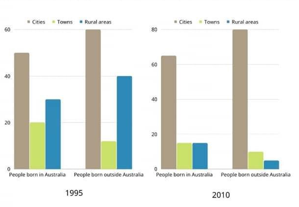
The bar chart below describes some changes about the percentage of people were born in Australia and who were born outside Australia living in urban, rural and town between 1995 and 2010.
Summarise the information by selecting and reporting the main features and make comparisons where relevant.
You should write at least 150 words.
Your Answer
Word Count: 0